Banesco Website — UX/UI consulting for a renewed digital presence
A digital product case focused on UX and UI consulting for Banesco Panamá’s website, supporting final-phase experience refinement, brand alignment
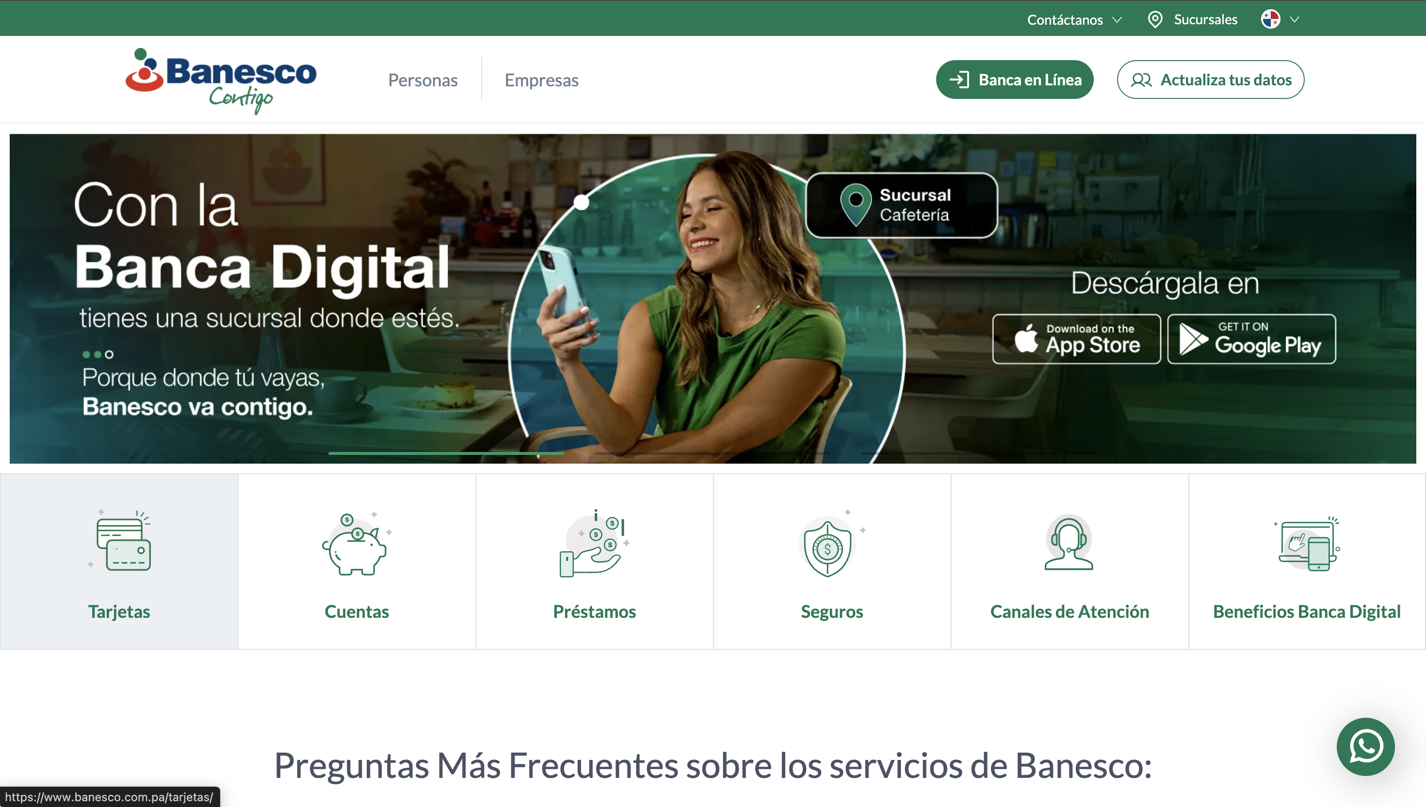
Overview
This project involved UX and UI consulting support for Banesco Panamá’s website during a stage of digital refinement tied to a renewed brand direction and broader digital evolution.
My participation was not as the primary delivery team, but as part of a consulting and design support effort in the final phases of the project. The initiative was mainly led by the marketing side together with an external provider, and my role centered on helping improve clarity, interface quality, and experience consistency before release.
Project Snapshot
- Client / Company: Banesco Panamá
- Project Type: Website / digital brand experience
- Industry: Banking / financial services
- Scope: UX/UI consulting, interface refinement, design system support, Figma collaboration, usability feedback
- My Role: UX/UI consultant
- Collaboration: Marketing team, third-party provider, internal stakeholders
- Stage of Involvement: Final phases, refinement and validation
Context
The website was part of a broader effort to strengthen Banesco Panamá’s digital presence under a more updated and coherent brand direction.
Because the project was already being developed mainly by marketing and a third-party provider, my contribution came in a more strategic and experience-focused layer: reviewing how the product felt, how the interface communicated trust and clarity, and how the final experience could be improved through better UX and UI decisions.
The Challenge
The challenge was not to redesign the entire product from scratch.
The real challenge was to enter at a later stage, understand what had already been defined, and help elevate the experience through focused decisions around clarity, consistency, hierarchy, and usability.
In projects like this, the work requires both design sensitivity and restraint. The goal is not to disrupt the process, but to strengthen it. That meant identifying where the experience still felt weak, where the interface needed more coherence, and where design decisions could better support trust and usability.
Goals
- Improve experience clarity in the final stages of the website
- Support stronger UX and UI consistency across screens and modules
- Help align interface decisions with the updated brand direction
- Contribute to the design system and Figma structure in collaboration with the provider
- Support UX validation through testing and client feedback
My Contribution
My contribution focused on UX and UI consulting, working closely with both the internal team and the external provider.
I supported the project through:
- interface review and refinement in Figma
- feedback on hierarchy, clarity, and visual consistency
- contribution to design system thinking and component alignment
- collaborative iteration with the third-party team
- UX validation input based on testing sessions with different participating clients
- final-phase improvements oriented toward maturity, usability, and trust
This was less about creating isolated screens and more about helping the final product feel more coherent and resolved.
Approach
My approach was based on reading the project as an experience system rather than as a collection of pages.
That meant looking carefully at:
- how information was prioritized
- where the visual hierarchy felt too weak or too dense
- how brand expression translated into interface behavior
- whether modules felt coherent with one another
- how navigation and actions were understood by users
- what feedback from usability sessions revealed about friction or confusion
Because the project was already moving forward with a defined direction, my role was to provide judgment, refinement, and UX/UI clarity where it mattered most.
Key UX / UI Decisions
1. Strengthening hierarchy in high-trust content
Banking websites depend on clarity and trust. One of the key areas of contribution was helping important actions, service information, and navigation feel more legible and intentional.
2. Supporting consistency across modules and patterns
In collaborative environments with multiple stakeholders, interfaces can easily lose consistency. Part of the work involved reinforcing pattern alignment and helping modules feel more unified.
3. Refining brand expression through interface detail
A brand refresh is not only about colors or visuals. It also needs to feel consistent in rhythm, spacing, emphasis, and interaction cues. This was part of the refinement work.
4. Using UX testing feedback to validate or adjust decisions
Feedback from different participating clients helped reveal areas where the experience needed stronger clarity or simpler interpretation. This allowed some decisions to be reinforced and others to be adjusted.
5. Working within an existing process without adding noise
A key part of consulting work is knowing how to improve a product without overcomplicating the system around it. The focus stayed on useful refinements rather than unnecessary redesign.
Design System / Figma Collaboration
A relevant part of the work happened inside Figma and in collaboration with the provider’s design process.
This included:
- reviewing and refining interface decisions directly in design files
- supporting stronger consistency across reusable patterns
- contributing to design system alignment
- helping visual decisions feel more structured and scalable
- keeping collaboration fluid between consulting input and production work
Experience Validation
The UX side of the work was reinforced through testing with different clients who participated in validation sessions.
That phase was important because it grounded the design conversation in real user reactions instead of assumptions alone. It helped identify where the experience felt clear, where trust signals were working, and where some flows or content still needed refinement.
Outcome
The result of this work was not a full redesign authored independently, but a stronger final product shaped through consulting, collaboration, and focused UX/UI refinement.
The project benefited from:
- better experience consistency
- stronger hierarchy and clarity
- improved alignment between brand and interface
- design system support in the final stages
- UX-informed refinements validated through user testing
- closer collaboration between internal teams and the external provider
What This Project Reinforced
This project reinforced a type of work I value a lot: helping a product become clearer and more mature even when you enter in later phases.
Not every contribution comes from owning a project from the beginning. Sometimes the value is in seeing what is already there, understanding where the experience still needs support, and helping teams make more deliberate decisions before release.
For me, this case reflects that kind of role well: product-minded UX/UI consulting focused on clarity, trust, and refinement.