Tesseras RWADEX Dashboard — product design and front-end implementation for a tokenized asset market
A market product case focused on designing and implementing the RWADEX dashboard, built to help users explore tokenized real-world assets through a structured, modern, and market-facing interface.
Overview
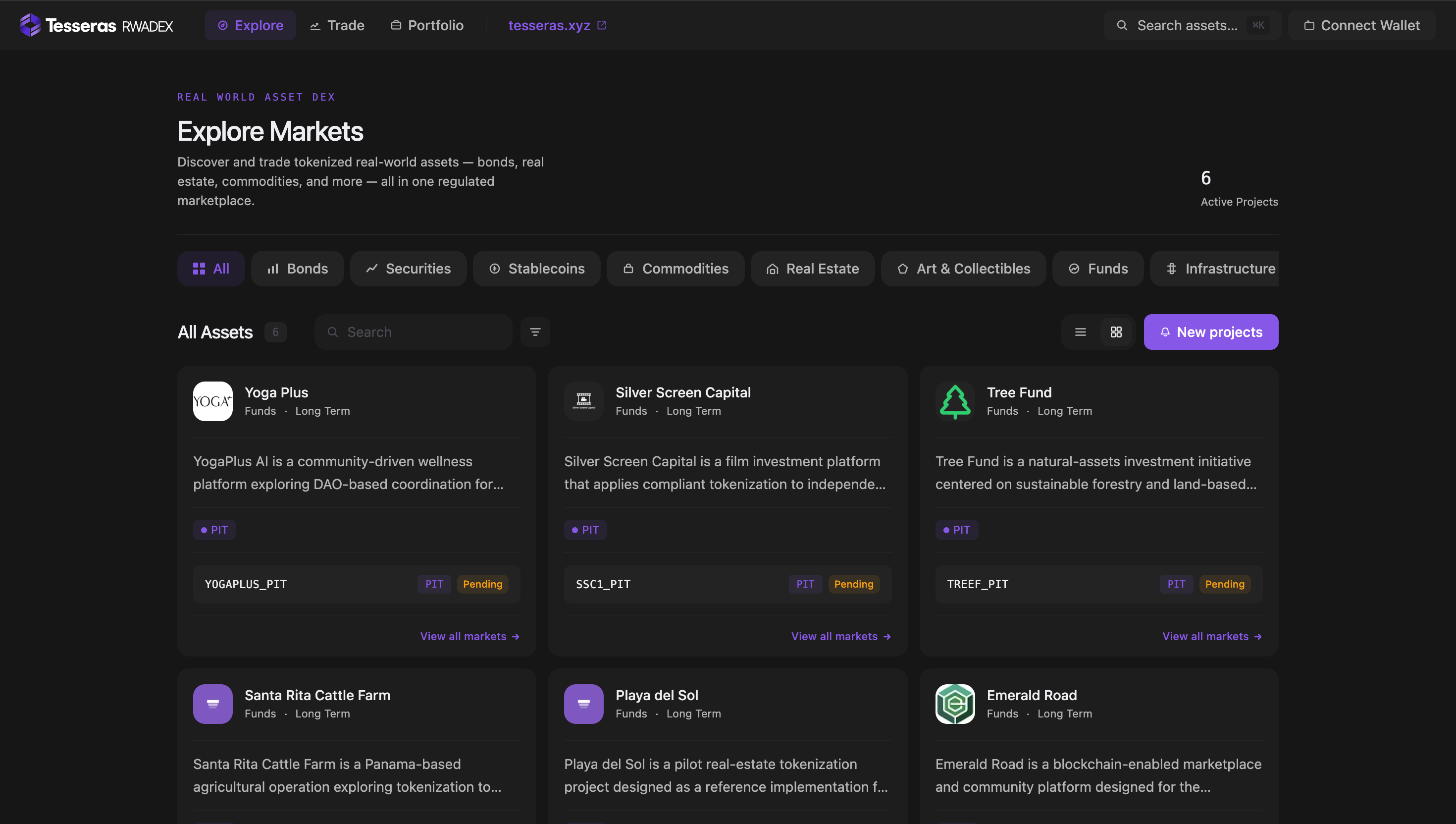
RWADEX is presented publicly as a market-facing platform for discovering and interacting with tokenized real-world assets. Tesseras describes it as a platform where assets can be discovered, understood, and interacted with through transparent market surfaces, while the public market view presents it as a place to “Explore Markets” and discover tokenized assets such as bonds, securities, stablecoins, commodities, real estate, art and collectibles, funds, and infrastructure.
This project focused on the dashboard and market-facing product experience. My work covered design and front-end implementation, helping shape the interface through which users engage with tokenized asset markets in a way that feels structured, modern, and understandable.
Project Snapshot
- Client / Company: Tesseras / RWADEX
- Project Type: Market dashboard / trading and discovery interface
- Industry: Tokenized assets / fintech / market infrastructure
- Scope: Product design, UX/UI, front-end implementation, market interface structure
- My Role: UX/UI Designer / Front-End
- Platform: Web app
- Main Focus: Asset discovery, market understanding, interface clarity, and structured product interaction
Context
The Tesseras site describes RWADEX Market as a live product for “trading and market discovery for tokenized real-world assets,” while the market interface itself opens with “Explore Markets” and a clear description of discovering and trading tokenized assets in one regulated marketplace. It also surfaces active project categories including bonds, securities, stablecoins, commodities, real estate, art & collectibles, funds, and infrastructure.
That context is important because market products like this sit at the intersection of information density, trust, and action. The dashboard needed to help users navigate asset categories, understand what they were looking at, and interact with the market through a system that felt transparent and stable.
The Challenge
The challenge was to design and implement a market dashboard that could feel sophisticated without becoming confusing.
A product like RWADEX has to support:
- discovery of tokenized assets
- categorization of different market types
- structured visibility into active projects
- a sense of legitimacy and trust
- repeated market interaction through a modern interface
The difficulty was not only visual. It was about building a product surface where information, navigation, and decision-making could coexist without collapsing into noise. In market-facing systems, even small interface decisions affect whether the product feels usable or overwhelming.
Goals
- Create a clear dashboard for exploring tokenized asset markets
- Support structured asset discovery and market interaction
- Build a modern product interface that feels trustworthy
- Implement the front-end experience with strong hierarchy and consistency
- Make the dashboard easier to scan and navigate
- Help the market product feel more mature and usable
My Contribution
I worked across both product design and front-end implementation for the RWADEX dashboard.
My contribution included:
- shaping the interface direction for the market-facing product
- supporting hierarchy across discovery, categories, and market surfaces
- helping the dashboard feel more readable and structured
- implementing the front-end experience
- contributing to a more modern and coherent interaction layer
- helping the product feel more aligned with trust, clarity, and market maturity
Because this is not a simple web page but an active market-facing product, the work required thinking beyond static layouts. The interface needed to hold real product meaning and support ongoing use.
Approach
My approach was to design the dashboard around market comprehension first.
That meant asking:
- What should users understand immediately?
- How should categories help orientation?
- How do we reduce friction in a product with multiple asset types?
- What visual hierarchy supports trust in a market context?
- How can the interface feel informative without becoming dense?
The public market UI reflects some of those priorities already: it opens with “Explore Markets,” introduces tokenized real-world assets directly, presents category filters across several asset classes, and structures the surface around active projects and all assets.
Key UX / UI Decisions
1. Prioritizing discovery and orientation
The interface opens with exploration and discovery rather than forcing users into complexity immediately. That is important because market products need a strong sense of orientation before deeper interaction.
2. Using categories to reduce cognitive load
The dashboard publicly groups market assets into categories such as bonds, securities, stablecoins, commodities, real estate, art & collectibles, funds, and infrastructure. That categorization helps structure a broad market into something easier to scan and understand.
3. Keeping the interface modern but controlled
A major design decision was to make the market feel current and product-grade without making it visually noisy. In financial and trading environments, visual restraint often supports trust more effectively than visual excess.
4. Designing for trust through structure
RWADEX is presented as a regulated marketplace, and Tesseras frames the broader ecosystem around transparency and structured market surfaces. In that context, the dashboard needed to support a clear and orderly reading experience.
5. Aligning market logic with front-end behavior
A market-facing product only feels mature when the interface mirrors the structure of the product well. A key part of the work was keeping interaction surfaces aligned with the underlying logic of categories, assets, and project states.
Front-End Implementation Perspective
A relevant strength of this project is that I worked not only on the visual and UX layer, but also on front-end implementation.
That mattered because market dashboards depend heavily on execution quality:
- category navigation needs to remain usable
- data surfaces need to stay readable
- layouts need to hold structured information well
- the experience needs to feel stable under repeated use
- the product needs to feel intentional in the browser, not just in mockups
Working across both design and implementation helped keep the dashboard more coherent. The goal was not to make the interface merely attractive, but to make it operationally understandable.
Outcome
The result was a more structured and modern dashboard experience for RWADEX.
The project delivered:
- a clearer market-facing product interface
- stronger discovery and category structure
- a more usable front-end layer for exploring tokenized assets
- better alignment between market logic and interface hierarchy
- a product surface that feels more mature, stable, and trustworthy
What This Project Reinforced
This project reinforced something I care about a lot in digital product work: market products need clarity as much as they need sophistication.
A platform like RWADEX becomes stronger when users can understand what they are seeing quickly, navigate confidently, and trust the structure of the interface. For me, this case reflects the kind of work I enjoy most: shaping complex product systems into interfaces that feel more usable, more readable, and more grounded in real implementation.