Tesseras Website — design and front-end implementation for real-world asset infrastructure
A digital infrastructure case focused on designing and implementing the Tesseras website, built to communicate a clear company narrative around tokenized real-world asset markets.
Overview
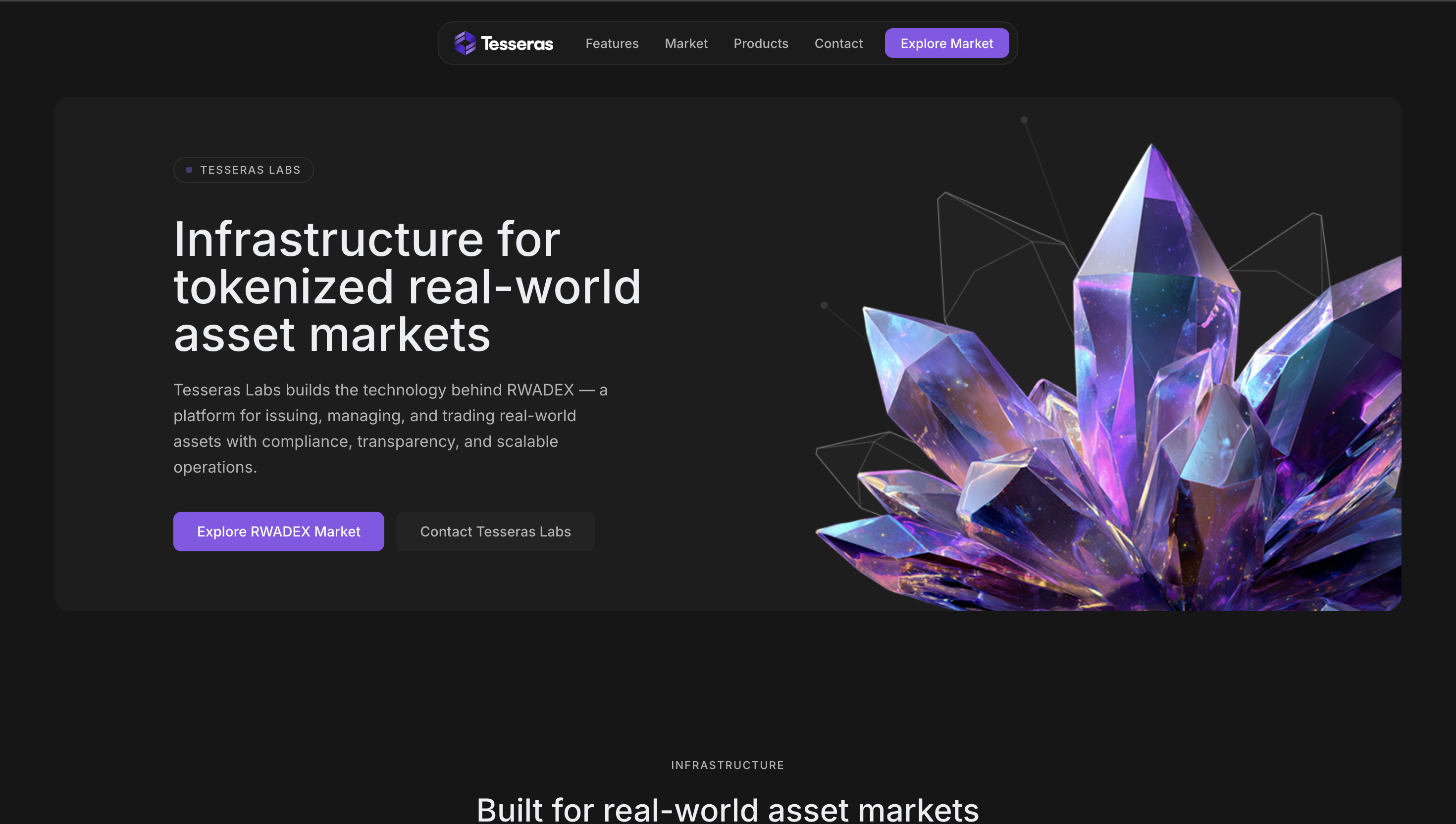
Tesseras is positioned publicly as the infrastructure layer behind tokenized real-world asset markets. The website introduces the company with a direct message: “Infrastructure for tokenized real-world asset markets,” and explains that Tesseras Labs builds the technology behind RWADEX, including issuance, management, and trading infrastructure for real-world assets with compliance, transparency, and scalable operations.
This project involved working across design and front-end implementation for the Tesseras website. The goal was to create a digital presence that could communicate a technically sophisticated infrastructure company in a way that still felt clear, structured, modern, and credible.
Project Snapshot
- Client / Company: Tesseras Labs
- Project Type: Infrastructure company website
- Industry: Real-world assets / tokenization / fintech infrastructure
- Scope: UX/UI design, front-end implementation, site structure, content hierarchy, product communication
- My Role: UX/UI Designer / Front-End
- Platform: Web
- Main Focus: Company positioning, product clarity, structured navigation, modern digital credibility
Context
The public site explains that Tesseras Labs supports real-world asset markets through connected infrastructure covering issuance, market participation, and operational workflows across the asset lifecycle. It also presents the company as the force behind a connected product suite including RWADEX Market, Issuer Platform, RWA Engine, a planned Data Platform, a planned Registry, and enterprise solutions.
That context shaped the project in an important way. The website had to explain a serious and highly structured domain without becoming heavy or unreadable. It needed to communicate infrastructure, compliance-aware systems, and product depth, while still feeling accessible enough for stakeholders, partners, and market participants to understand the offer quickly.
The Challenge
The challenge was to design and implement a website that could communicate a complex infrastructure narrative clearly.
Tesseras is not a simple landing page product. The company sits across multiple layers:
- infrastructure for tokenized asset markets
- market-facing products like RWADEX
- issuer-facing operational products
- enterprise solutions
- compliance-aware workflows
- AI-assisted operational systems
A site like that can easily become overloaded with jargon, disconnected sections, or abstract messaging. The real challenge was to create a structure that made the ecosystem feel connected and understandable.
Goals
- Build a credible website for Tesseras Labs
- Communicate infrastructure value clearly
- Organize multiple products under one coherent company narrative
- Support trust through structure, clarity, and restrained design
- Implement the front-end experience in a way that felt modern and scalable
- Help the company feel both technically serious and easy to understand
My Contribution
I worked across both design and front-end implementation for the website.
My contribution included:
- shaping the information architecture of the site
- designing the UX/UI direction for the company presentation
- structuring the relationship between Tesseras and the RWADEX product family
- supporting hierarchy across infrastructure, product, and FAQ sections
- implementing the front-end experience
- helping the site feel minimal, modern, and more coherent despite the complexity of the subject matter
This work required balancing clarity and credibility at the same time. The site needed to feel mature enough for infrastructure and enterprise conversations, while still staying readable and focused. That balance shaped both the design and implementation decisions.
Approach
My approach was to treat the site as a systems narrative rather than a standard marketing homepage.
That meant organizing the experience around a few strong layers:
- what Tesseras is
- what infrastructure it provides
- how RWADEX fits into that picture
- what products exist today
- what is incubating, active, or planned
- who the company is built for
The public site reflects that structure clearly. It opens with the core company proposition, then moves into infrastructure, RWADEX Market, the broader product suite, FAQ, and a partnership section inviting companies to “design and deploy infrastructure for real-world asset markets.”
Key UX / UI Decisions
1. Leading with infrastructure, not feature noise
The homepage makes the company’s role clear immediately: Tesseras builds infrastructure for tokenized real-world asset markets. That matters because visitors need the strategic frame before they can understand the products underneath.
2. Structuring the ecosystem as a connected suite
The site publicly presents multiple products with different states such as live, incubating, active, planned, and enterprise. Organizing those into one readable system was an important UX decision because it helped avoid fragmentation.
3. Supporting clarity in a compliance-heavy domain
Tesseras explicitly highlights “Compliance by design” and operational scalability. In a product space like this, interface clarity is part of trust. The design needed to support seriousness without becoming visually dense.
4. Using restrained visuals to support credibility
A key design choice was keeping the website visually controlled. In high-trust infrastructure contexts, minimalism can support credibility better than decorative complexity, especially when the subject matter is already conceptually heavy.
5. Connecting Tesseras and RWADEX without confusion
Because the site explains that Tesseras builds the technology behind RWADEX, the relationship between company and product had to stay explicit. A clear company-product narrative helps visitors understand whether they are looking at infrastructure, market products, or both.
Front-End Implementation Perspective
A major part of the value in this project came from working not only on the design side, but also on front-end implementation.
That mattered because the site needed:
- strong section rhythm across dense strategic content
- scalable modules for products and FAQ
- clear navigation between company and product layers
- consistent visual hierarchy
- a modern browser experience that made complex information feel lighter
Minimal websites are not automatically simple to implement well. In this case, front-end discipline was essential to make the structure feel clear, stable, and credible.
Outcome
The result was a modern and structured company website for Tesseras Labs.
The project delivered:
- a clearer digital presence for the company
- better organization across infrastructure and product messaging
- stronger hierarchy for a multi-layered ecosystem
- a more credible and modern presentation of the company’s value
- a front-end implementation aligned with the seriousness of the domain
What This Project Reinforced
This project reinforced something I value a lot in digital product and infrastructure work: clarity becomes even more important when the subject is complex.
A company like Tesseras does not benefit from sounding more complicated than it already is. It benefits from structure, hierarchy, and design restraint that help people understand the system with less effort. For me, this case reflects the kind of work I enjoy most: taking a dense, strategic product space and turning it into a more readable digital experience.