UILevel — minimalist design and development for a boutique digital studio
A brand and website case focused on designing and developing UILevel as a modern boutique studio site, with a minimal visual system, clear service communication, and a structured digital
Overview
UILevel is a boutique digital studio website built to communicate a focused offer around product design, full-stack development, websites, no-code work, and brand identity.
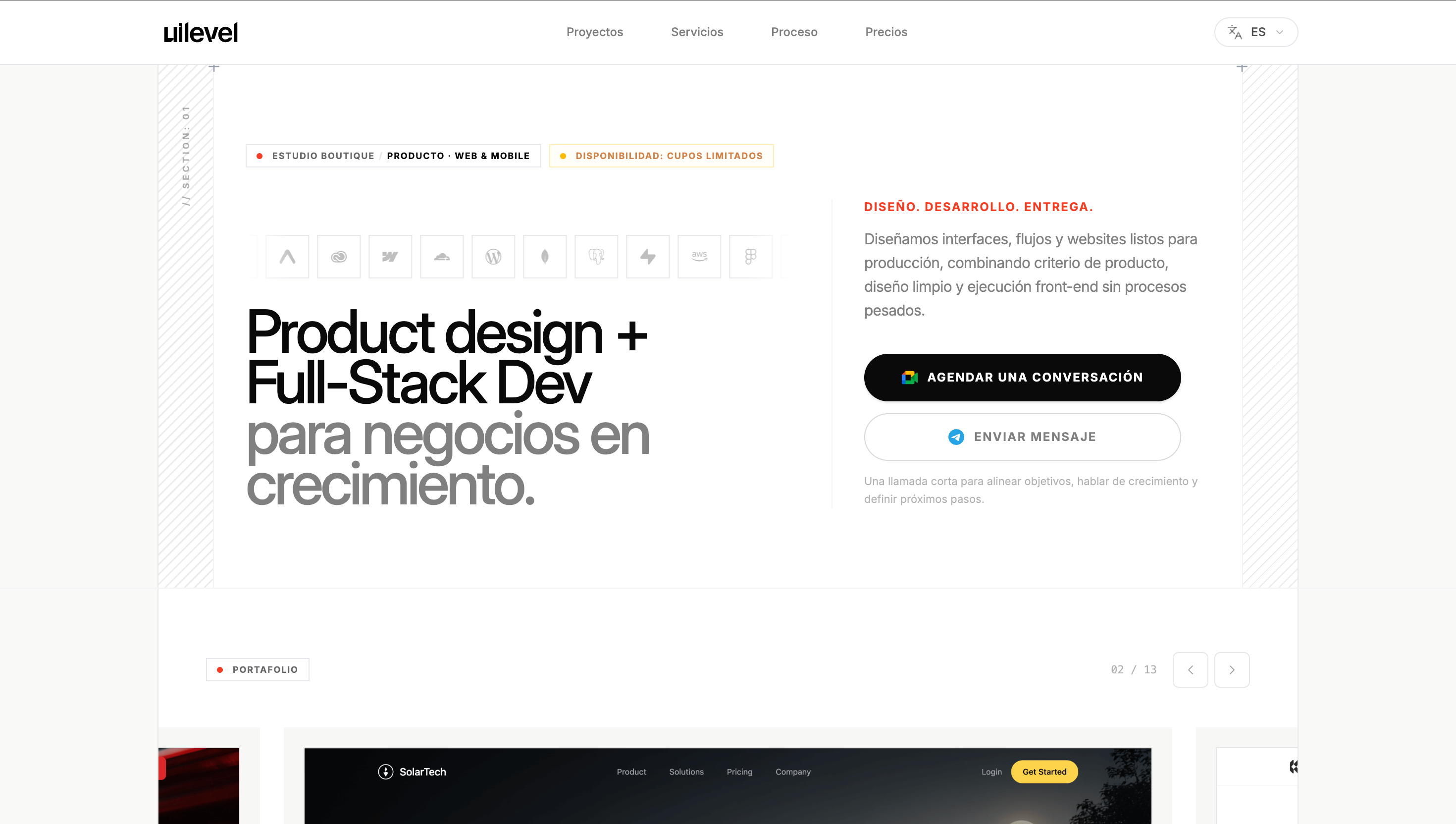
On the public site, UILevel presents itself with a direct proposition: “Product design + Full-Stack Dev for startups and growing teams,” supported by the phrase “Design. Code. Ship.” It describes the studio as a team that designs and builds products for web and mobile, websites and no-code experiences, and brand identity with a clear process and consistent delivery.
This project involved working across the full line from design to development, shaping a website that needed to feel minimal, modern, credible, and aligned with the kind of product and service work the studio offers.
Project Snapshot
- Client / Company: UILevel
- Project Type: Studio brand website
- Industry: Product design / development studio
- Scope: UX/UI design, front-end development, site structure, service communication, implementation
- My Role: Product Designer / UX/UI / Front-End / Builder
- Platform: Web
- Main Focus: Minimal design system, clear offer communication, modern studio presence
Context
The site is designed to position UILevel as a boutique studio for startups and growing teams, with a service model built around end-to-end execution. Publicly, it organizes its offer around six services: Product Design, Product Development, Website & No-Code, Brand Identity, Motion & Interaction, and design/dev execution under one studio. It also includes portfolio, pricing, testimonials, FAQ, and contact points such as a 15-minute intro call and messaging CTA.
That context shaped the project in an important way. The website could not feel overly corporate, noisy, or generic. It needed to reflect a design-led, execution-aware studio identity with enough structure to communicate services clearly while still feeling calm and modern.
The Challenge
The challenge was to create a studio website that felt both simple and commercially effective.
A site like this has to communicate:
- what the studio does
- who it helps
- how the offer is structured
- why the work is credible
- how a potential client should take the next step
At the same time, it needed to stay visually restrained. A common risk in studio sites is trying to prove too much through complexity. The goal here was the opposite: use clarity, hierarchy, and a clean visual system to make the offer feel stronger.
Goals
- Build a modern digital presence for UILevel
- Communicate the studio offer clearly and quickly
- Create a minimal and polished visual direction
- Support multiple service categories without clutter
- Design and develop a site that feels credible and easy to scan
- Keep the experience aligned with the studio’s product-minded positioning
My Contribution
This was an end-to-end project where I worked from design through development.
My contribution included:
- defining the site structure and overall content flow
- designing the UX/UI direction with a minimal and modern aesthetic
- building the front-end implementation
- organizing the service presentation and section hierarchy
- supporting a more refined visual language for the brand
- helping the site communicate the studio’s offer in a direct and structured way
- shaping a digital experience that reflects both design sensibility and implementation quality
Because UILevel represents a studio offer rather than a single product, the project required balancing brand presence, clarity of services, and conversion intent.
Approach
My approach was to treat the site as a structured service platform rather than a decorative agency homepage.
That meant focusing on:
- clear messaging at the top of the page
- strong hierarchy between services and supporting sections
- minimal but intentional visual language
- enough modular structure to support portfolio, pricing, and FAQ
- a front-end experience that felt clean, modern, and credible
The public structure of the site reflects that approach. It leads with a strong service proposition, then presents the studio’s six services, followed by supporting sections such as portfolio, pricing, testimonials, and FAQ. That creates a site flow that is easier to understand and more commercially useful.
Key UX / UI Decisions
1. Leading with a direct value proposition
The site opens with a clear statement of what UILevel does and who it serves: product design and full-stack development for startups and growing teams. That kind of clarity matters because visitors should not need to decode the offer.
2. Keeping the visual system minimal and modern
A major design decision was to avoid visual noise. The site needed to feel polished and contemporary without becoming heavy. That meant relying on hierarchy, spacing, contrast, and typography more than decorative complexity.
3. Structuring services as a clear operating model
The site publicly presents six services under one studio. Organizing that breadth without making the offer feel scattered required a strong section system and clear content grouping.
4. Supporting trust through simple structure
Instead of overloading the site with too many competing messages, trust is supported through cleaner composition, portfolio visibility, pricing, testimonials, and FAQ. This allows the studio to feel more mature and more transparent.
5. Aligning design tone with execution promise
The phrase “Design. Code. Ship.” suggests a studio that is not only aesthetic, but delivery-oriented. A key part of the work was making the interface feel aligned with that promise: clean, focused, and practical.
Front-End and Implementation Perspective
A relevant strength of this project is that I worked across both design and implementation.
That matters because minimalist websites only feel strong when the details are resolved carefully in the browser:
- spacing needs to feel intentional
- section rhythm needs to stay balanced
- service blocks need to remain readable
- portfolio and pricing areas need to scale clearly
- the site needs to feel light without feeling empty
Working across UX/UI and front-end helped keep the result consistent. The site feels simple, but that simplicity depends on implementation discipline as much as visual direction.
Outcome
The result was a modern and structured studio website for UILevel.
The project delivered:
- a clean brand presence for the studio
- clearer communication of service offerings
- a minimal and polished visual direction
- a scalable structure for portfolio, pricing, and supporting content
- a stronger alignment between brand message and digital experience
- a site that reflects both design capability and development awareness
What This Project Reinforced
This project reinforced something I care about a lot: minimal websites still require strong product and interface thinking.
A site can look visually quiet and still do a lot of work underneath. In this case, the value came from using structure, hierarchy, and restrained design to make the studio’s offer easier to understand and more credible.
For me, UILevel reflects the kind of digital work I enjoy most: clean systems, modern interfaces, and design that feels connected to real implementation.