Upper Apps Pro — design, development, and product infrastructure for an indie product lab
A product and platform case about building Upper Apps Pro as an indie product lab, covering design, front-end development, blog system, content structure, and the digital foundation
Overview
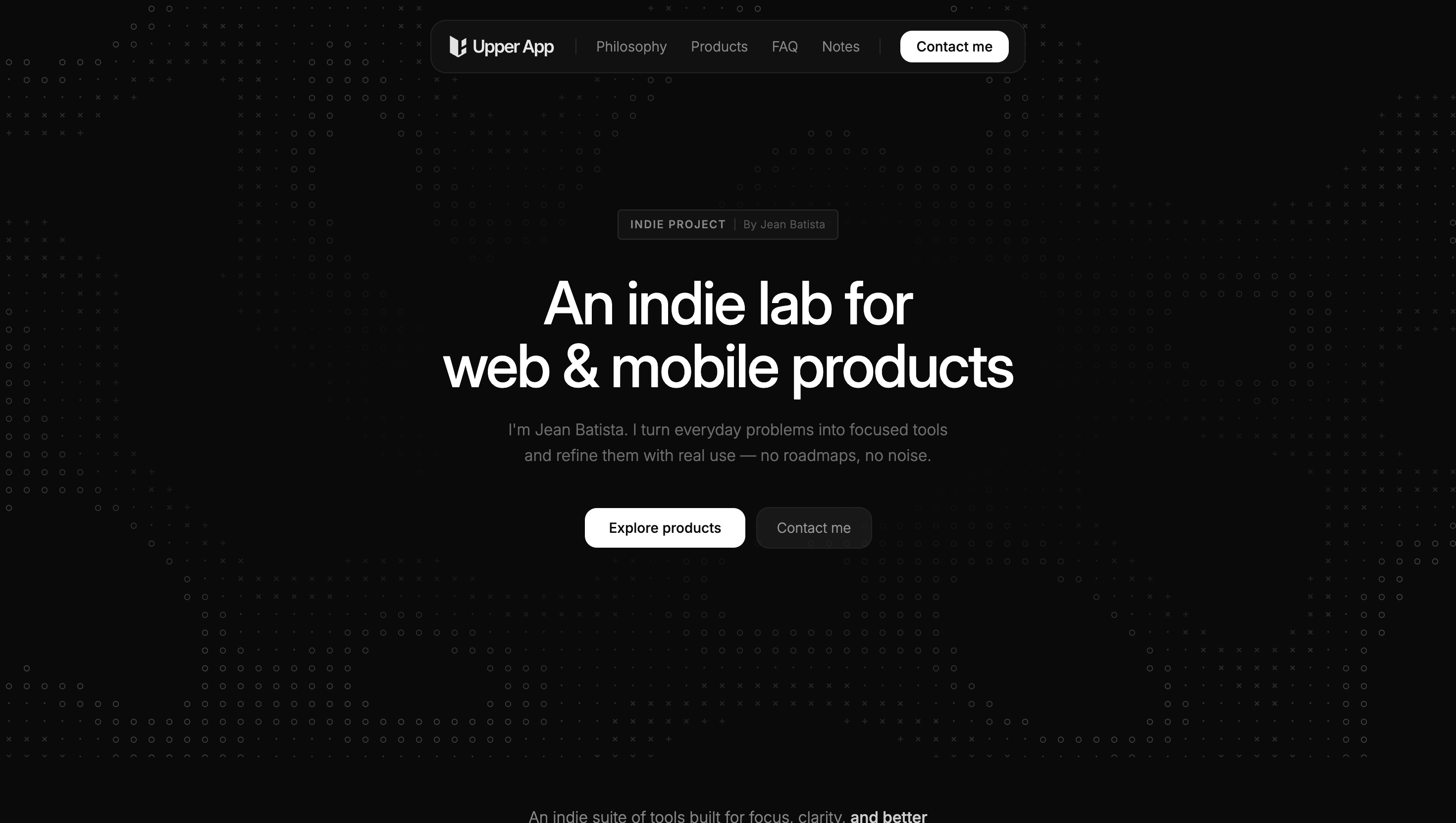
Upper Apps Pro is my indie product lab: a focused space where I build and refine digital products around real problems, everyday workflows, and practical software ideas. On the public site, it is presented as “an indie lab for web & mobile products” and as a place where I turn everyday problems into simple tools for focus, productivity, and better digital habits.
This project was not only about creating a brand site. It was about building the digital home for a growing product ecosystem: one that needed to communicate philosophy, present products clearly, support notes and updates, and feel structured enough to grow over time. The work covered the full line from design to development, implementation, and deployment.
Project Snapshot
- Client / Company: Upper Apps Pro
- Project Type: Indie product lab / brand and product platform
- Industry: SaaS / software products / indie products
- Scope: Product positioning, UX/UI design, front-end development, blog system, content structure, implementation, deployment
- My Role: Product Designer / UX/UI / Front-End / Builder
- Platform: Web
- Main Focus: Brand site, product showcase, notes system, clear information architecture
Context
The site positions Upper Apps Pro as an indie product studio built around focused execution and real use. Its public messaging emphasizes building in-house SaaS products for productivity, forms, and everyday digital workflows, while separating that identity from client work handled through UILevel. It also highlights a visible philosophy: usefulness over noise, small scope with strong execution, and iteration through shipping and learning.
That context shaped the project in an important way. The website could not feel like a generic startup landing page. It needed to feel calm, minimal, product-minded, and credible. It also needed enough structure to support multiple products, evolving notes, and a growing editorial layer without becoming cluttered.
The Challenge
The challenge was to create a site that felt simple on the surface, while still carrying multiple responsibilities underneath.
Upper Apps Pro needed to:
- communicate a clear identity
- explain the philosophy behind the products
- present several projects in a focused way
- support a notes or blog system
- separate the indie product identity from service work
- stay visually minimal without feeling empty
- remain flexible enough to evolve as the lab grows
The real challenge was not adding more sections. It was deciding what mattered most and building a structure that could stay clear as more products and content were added.
Goals
- Build a clean digital home for Upper Apps Pro
- Communicate the lab’s philosophy with clarity
- Present products in a simple and structured way
- Create a minimal but mature visual system
- Support a notes/blog system for updates and reflections
- Keep navigation and information architecture easy to understand
- Design and develop a site that could scale with future products
My Contribution
This was an end-to-end project where I worked across design, development, implementation, and deployment.
My contribution included:
- defining the overall structure of the site
- designing the visual direction with a minimal and clean approach
- shaping content hierarchy and information architecture
- building the front-end experience
- implementing the notes/blog system
- structuring the product showcase area
- organizing the site so it could support multiple in-house products clearly
- deploying and refining the platform as part of the broader product ecosystem
Because Upper Apps Pro is also part of my own long-term product environment, the work was not only executional. It was also editorial, structural, and strategic.
Approach
My approach was to treat the site less like a marketing page and more like a product platform with editorial depth.
That meant prioritizing:
- clarity over volume
- structure before decoration
- strong hierarchy with minimal visual noise
- reusable sections and scalable content patterns
- a layout system that could hold products, philosophy, FAQ, and notes without feeling fragmented
The site’s visible structure reflects that intention. It includes dedicated navigation for Philosophy, Products, FAQ, and Notes, plus a product suite section, a philosophy section, published notes, and quick answers about the lab. That reinforced the idea that the project was not just a landing page, but a structured home for an evolving body of work.
Key UX / UI Decisions
1. Keeping the visual direction minimal and calm
A core design decision was to avoid noise. The site needed to feel light, modern, and restrained so the products and ideas could speak more clearly. That fits the philosophy stated on the site itself: “Usefulness over noise.”
2. Building around clear information architecture
Instead of overloading the homepage, the structure was organized around a few strong sections: philosophy, products, notes, FAQ, and contact. This helps the site feel easier to scan and easier to grow.
3. Treating notes as part of the product ecosystem
The notes section was important not just as content marketing, but as part of the lab’s identity. The site publicly presents notes and updates as releases, updates, and honest thoughts on building indie products in the open. That editorial layer helps the platform feel more alive and more personal.
4. Creating a product showcase without visual clutter
Upper Apps Pro publicly features multiple products including Kitoform, Claromi, Dequestion, and UILevel. Presenting several products on one site required restraint, so the showcase could feel focused instead of crowded.
5. Aligning brand tone and interface behavior
The site speaks in a calm, practical voice about focused versions, real use, and iteration through shipping. A key design goal was to make the interface feel aligned with that tone: direct, minimal, deliberate, and clear.
Blog / Notes System
A relevant part of the project was the implementation of a notes system that supports ongoing publishing. The public site includes a Notes section with published entries and an “All notes & updates” area, showing that content is not secondary, but part of the platform’s core structure.
From a product perspective, this mattered because the site needed to support not only static brand communication, but also evolving writing around decisions, releases, and product thinking. That made the blog system part of the platform design, not just an add-on.
Front-End and Implementation Perspective
One of the strengths of this project is that I worked across both interface design and implementation.
That matters because a minimal site only works well when details are resolved carefully in the front-end:
- spacing needs to feel intentional
- hierarchy needs to stay consistent
- content blocks need to scale well
- product cards and notes need to remain readable
- the system needs to feel clean without becoming rigid
Working across design and development helped keep the result coherent. The site feels simple, but that simplicity comes from decisions about structure, implementation, and restraint.
Outcome
The outcome was a clean and scalable digital home for Upper Apps Pro as an indie product lab.
The project resulted in:
- a minimal and clear brand site
- a product platform capable of presenting multiple in-house tools
- a structured notes/blog system
- clearer communication around philosophy and product direction
- a more mature and cohesive digital presence for the lab
- a foundation that can continue evolving as more products and notes are added
What This Project Reinforced
This project reinforced something I care about a lot: simple websites still need strong product thinking.
A site like this can look minimal on the surface, but the value comes from how well it organizes ideas, products, and future growth. For me, Upper Apps Pro reflects the kind of work I enjoy most: building digital systems that feel clean, useful, and intentional from both the design and implementation side.