Venmetro — UX/UI and front-end design for a digital lending experience
A fintech product case focused on UX/UI design and front-end execution for Venmetro, a digital lending platform in Panama. The work centered on improving clarity, trust
Overview
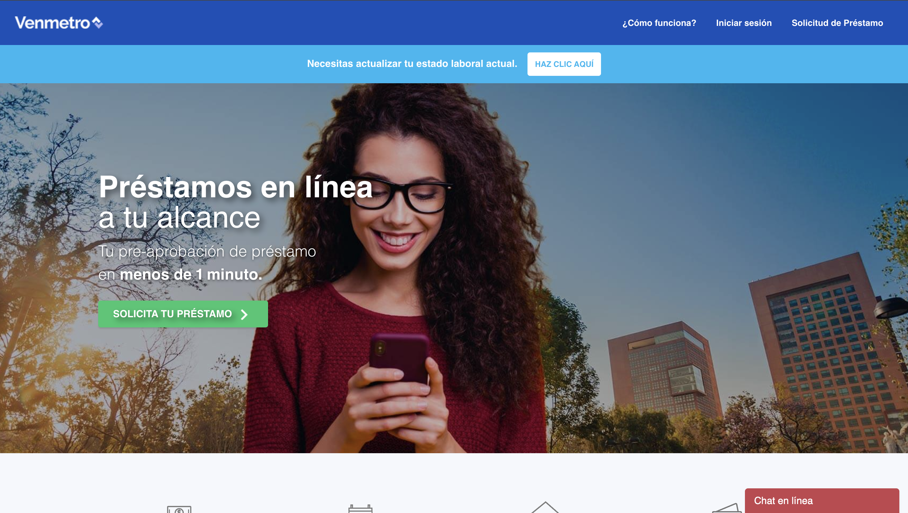
This project focused on supporting Venmetro through UX/UI design and front-end work for a digital lending experience built around online personal loan applications.
Venmetro positions itself as an online lending platform in Panama designed to simplify personal loan requests through a digital process, allowing users to register, complete forms, upload documents, and continue the application online. Publicly, the platform describes itself as a technology-driven financial service that helps reduce friction in the lending process and offers a fully digital experience for applicants.
My role in this project combined product-minded UX/UI design with front-end execution, helping shape interfaces that needed to feel clear, reliable, and easy to use in a financial context where trust and process clarity matter a lot.
Project Snapshot
- Client / Company: Venmetro
- Project Type: Fintech platform / digital loan application experience
- Industry: Financial services / lending
- Scope: UX/UI design, front-end implementation, flow refinement, interface clarity
- My Role: UX/UI Designer / Front-End
- Platform: Web
- Main Focus: Loan application experience, user guidance, interface trust, and product clarity
Context
Venmetro’s public website presents the product as a platform where users can request personal loans online, create an account, complete a form, upload required documents, and move through a structured application process. The company also explains requirements such as proof of residence, valid ID or passport, proof of employment, and income documentation as part of the lending journey.
In that type of product, design is not only about aesthetics. The interface needs to help users understand what to do, what information is required, what happens next, and how the process works from one stage to another.
This makes UX especially important because users are not just browsing content. They are making decisions, submitting personal information, and moving through a trust-sensitive financial workflow.
The Challenge
The challenge in a digital lending product is not only to make the interface look modern.
The real challenge is to reduce hesitation inside a process that can easily feel heavy, bureaucratic, or unclear. Users need to understand the steps, feel guided through documentation and application requirements, and trust that the platform is legitimate and organized.
Venmetro publicly communicates a relatively structured process:
- Create an account
- Complete the form
- Move forward with approval and next steps
That sounds simple, but making a flow like that feel simple in practice requires careful work in hierarchy, form structure, interface language, guidance, and front-end behavior.
Goals
- Improve clarity across the digital loan application flow
- Make the experience feel more trustworthy and understandable
- Support a cleaner and more usable UI
- Help users move through the application process with less friction
- Connect interface design with front-end implementation in a practical way
- Strengthen the product experience across key lending touchpoints
My Contribution
My role combined UX/UI thinking with front-end execution.
I contributed through:
- designing and refining product interfaces for the web experience
- improving clarity across forms, layout, and user actions
- translating design decisions into front-end implementation
- helping the product feel more structured and easier to navigate
- working on screens and interaction patterns connected to the loan application process
- supporting a more mature and trustworthy interface language for a fintech environment
Because this was a financial product, the work required more than visual polish. It required thinking about how interface decisions affect confidence, comprehension, and completion.
Approach
My approach was centered on clarity and flow.
Instead of treating the site only as a marketing surface, I looked at it as a product experience with operational steps, user questions, and moments of hesitation that needed to be reduced.
That meant paying attention to:
- how the process was introduced
- how users understood the steps
- how forms and actions were organized
- where the interface needed stronger hierarchy
- how visual structure could reduce confusion
- how front-end implementation could support a smoother experience
In products like this, the interaction layer matters a lot. A user should not have to decode the process while already dealing with financial decisions and document requirements.
Key UX / UI Decisions
1. Making the process feel guided
Loan application flows can feel intimidating when the user does not understand what happens next. A key part of the work was helping the experience feel more sequential, readable, and guided.
2. Improving trust through interface clarity
In lending products, trust is shaped through small interface decisions: hierarchy, spacing, consistency, labels, and how clearly the platform explains requirements and steps.
3. Supporting form usability
Because the product depends heavily on user input and documentation, form-related UX became especially important. Clear structure and understandable actions help reduce abandonment and confusion.
4. Connecting UI decisions with front-end reality
Part of the value I brought to the project came from working across both design and implementation. This helped keep decisions practical and aligned with how the product would actually behave in the browser.
5. Reducing visual and cognitive noise
Financial interfaces often become heavy very quickly. A strong part of the work was helping the product feel more focused and less noisy, so users could concentrate on what mattered.
Front-End Perspective
One of the strengths of this project was the ability to work not only at the interface design level, but also through front-end execution.
That matters because in digital products, especially form-heavy products, a lot of the real experience depends on implementation detail:
- how layouts respond
- how actions feel
- how form states behave
- how components stay consistent
- how friction is reduced through interaction quality
Bridging design and front-end helped make the experience feel more coherent and grounded.
Outcome
The result was a stronger digital product experience shaped through UX/UI design and front-end thinking.
The project benefited from:
- clearer loan application flows
- a more trustworthy interface feel
- stronger usability across key screens
- better alignment between design decisions and implementation
- a more practical and mature web product experience
What This Project Reinforced
This project reinforced something I value a lot in digital product work: when people are completing a high-friction task, clarity matters more than decoration.
In fintech products, users do not only need a modern-looking interface. They need to understand the process, trust the product, and move through it without unnecessary doubt.
This case reflects that kind of work well: product-focused UX/UI and front-end execution aimed at making a digital financial experience feel clearer, calmer, and more usable.